You probably already have the symptom. Support keeps closing tickets, onboarding looks smooth on paper, and the dashboard still doesn’t tell you why certain accounts feel harder to work with than others. That gap is exactly where customer effort score earns its keep, because it turns a vague “this journey feels clunky” complaint into a service KPI that RevOps can track by touchpoint, channel, and owner.
In B2B environments, that matters more than many teams admit. A customer can be satisfied with a friendly rep and still burn too much time getting an issue resolved, moving through handoffs, or completing a purchase step. CES gives you a way to catch that friction early, before it shows up as escalations, rework, or weaker retention signals.
What Customer Effort Score Tells You
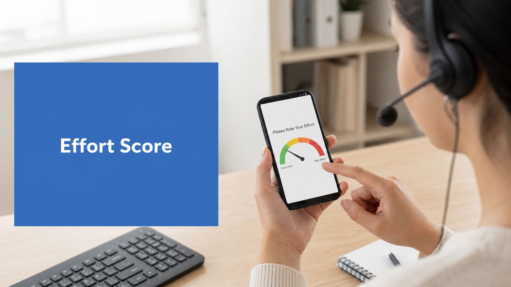
A lot of teams start with CSAT because it feels familiar, or NPS because leadership already likes the number. Neither one shows, with much precision, where the journey is breaking. Customer effort score is the cleaner operational signal because it measures how much work a customer had to do to complete an interaction, resolve an issue, or use a product or service, and IBM frames it as an average built from survey responses divided by the number of responses (IBM on Customer Effort Score).
That makes CES useful when the question is not whether customers liked you, but how hard you made the task. CSAT measures satisfaction after the interaction, while CES measures friction inside the interaction itself. NPS asks about likely recommendation, which helps with broader loyalty conversations, but it is too far removed from a single workflow to diagnose a broken handoff or a messy onboarding step.

The practical value for RevOps teams
For RevOps, the value is not the score itself. CES turns subjective effort into something you can compare across support, purchase, onboarding, and sales handoff journeys. Salesforce notes that many organisations measure CES after service interactions, and Zendesk describes it as a survey-based way to assess ease after tasks such as resolving issues, finding answers, or returning a purchase (Salesforce on CES in service metrics, Zendesk on Customer Effort Score).
Practical rule: if the journey feels harder than it should, CES is usually the metric that surfaces it first.
That matters because lower-effort journeys usually create fewer escalations and cleaner retention signals. Higher-effort journeys point to routing problems, knowledge gaps, broken automation, or handoff friction that operations teams can fix. In practice, that is where CES earns its place in a RevOps stack. It shows which touchpoints create drag, which teams absorb that drag, and where the customer has to work too hard to move forward.
Survey Design and Sampling That Works for B2B
A good CES survey stays out of the way. It asks one clear question right after the relevant action, then stops. SurveyMonkey describes CES as a short post-interaction survey tied to a specific task, and practical guidance from Balto on what makes a good Customer Effort Score survey recommends keeping the survey to 1 to 3 questions maximum (SurveyMonkey on using Customer Effort Score).
Pick the question that matches the moment
The wording should match the event, not the department. A support closure deserves different language from a sales handoff or onboarding step, because the customer is judging a different kind of effort each time.
Use variations like these:
- Issue resolved: “How easy was it to resolve your issue today?”
- Purchase completed: “How easy was it to complete your purchase?”
- Onboarding step finished: “How easy was it to complete this onboarding step?”
- Support handoff closed: “How easy was it to get the right help from the right team?”
A 1 to 5 scale works well when you want a shorter response path. A 1 to 7 scale gives more spread and is common in industry guidance, which also notes that CES is usually captured as a single post-interaction question on one of those scales (IBM on CES). In B2B, that extra spread helps when account volume is low and every response matters.
Sample by value, not by habit
B2B teams usually get better signal when they sample by account tier, journey stage, and touchpoint instead of blasting every contact. High-value accounts deserve tighter recency windows and stronger suppression rules, because fatigue affects response quality long before it shows up in a dashboard.
Use the account hierarchy to avoid duplicate asks. If a contact just answered a CES after a support interaction, suppress the next survey for a defined period, and cap how often the account can receive effort requests across channels. That matters in long enterprise relationships where the same person can pass through service, onboarding, and renewal conversations in a short span.
Keep CES close to the action, but never so close that the same buyer feels chased by your surveys.
For teams sending from email, the cleanest pattern is to pair the CES ask with the specific event and keep the follow-up short. If you want a complementary email framework, this guide to B2B email marketing best practices fits well alongside a CES programme.
Calculating CES the Way Your CFO Will Trust
There are three calculation methods people accept in B2B CES programmes. Adience describes them as a mean score on a 5- or 7-point scale, a net-positive percentage, or a positive-minus-negative index scaled from -100 to 100 (Adience on Customer Effort Score in B2B research). The right one depends on how your team reports, how your dashboard is built, and how much statistical rigour the leadership team expects.
Choose the format that fits the audience
| Method | Formula | Best for | Watch out for |
|---|---|---|---|
| Mean score | Total CES ratings divided by number of responses | Simple executive reporting and month-over-month tracking | Can hide spread and mask mixed journey quality |
| Positive percentage | Share of responses in the low-effort band | Boards and leaders who want a clean performance readout | Different tools define “positive” differently |
| Positive-minus-negative index | Positive share minus negative share, scaled to -100 to 100 | Teams that want sharper separation between easy and hard experiences | Needs clear band definitions and consistent survey design |
A worked example makes the logic easier. If ten customers respond and the scores are mostly clustered at the easy end, the mean will look healthy, the positive percentage will show a strong low-effort signal, and the index will make the gap between easy and hard experiences even more visible. The key is not the formula alone, it’s whether the numbers reflect one journey or several very different ones.
Don’t blend unlike journeys
Many B2B teams trip themselves up. Onboarding, support, and renewal are not comparable experiences, so combining them into one “company CES” often creates a false sense of consistency. A blended score can go up or down for reasons that have nothing to do with the process leadership is trying to improve.
Track the score by touchpoint first, then roll up only when the underlying journeys are similar enough to compare. If you want a CFO-friendly view, use the average only as the top line and keep the distribution, the low-effort share, and the high-effort pockets visible underneath it. That gives finance a number, and it gives operations a diagnosis.
Benchmarks That Match Your Scale and Channel
Benchmark confusion usually starts when teams mix scale-based targets with percentage-based targets. The practical read is simple, a CES above 5.0 on a 1 to 7 scale is generally considered good, 5.5 to 6.0 sits above average, and percentage-based benchmarks usually treat 80%+ as good, below 70% as an improvement opportunity, and 90%+ as strong. Balto gives a similar rule of thumb for low-effort performance, with 4.0+ on a 1 to 5 scale, 5.5+ on a 1 to 7 scale, or 80%+ positive responses treated as healthy performance (Balto on Customer Effort Score benchmarks).

Translate the benchmark into your scale
A 1 to 7 scale and a percentage-positive model can describe the same operational reality, but they do not read the same way in a board pack. If your survey tool produces an average score, convert it only when the conversion preserves your original band definitions. If leadership expects percentages, do not force a raw mean into a story it cannot support.
Salesforce has also noted that more recent benchmark data cited in 2025 to 2026 puts average CES at 72 across industries, with scores above 90% described as exceptional and ecommerce targets often set at 82 to 90%. That gives you a rough market context, but it still does not replace your own channel mix or journey design.
Use the right benchmark for the right journey
Support, onboarding, and self-serve usually have different effort profiles. A self-serve knowledge path that scores well is doing its job, while a complex enterprise renewal path may need a different target because the work is naturally heavier. A single global target can make healthy discovery or qualification journeys look bad when the team is supposed to ask more questions and slow the process down.
The contrarian point matters. High CES is not always desirable. In early discovery or qualification, some friction is healthy because it keeps the team from over-accelerating a poor-fit deal. The benchmark should guide the motion, not flatten every revenue stage into the same expectation.
A benchmark only helps if the survey distribution matches the channel and the stage. Email follow-up after a clean handoff should be judged differently from an in-app task-completion prompt or a support-closure survey, because each one captures a different kind of effort. That is also why teams that run CES alongside broader email programs should keep the surrounding cadence tight, as described in B2B email marketing best practices, so the benchmark reflects the journey and not survey fatigue.
Implementing CES Across Email, In-App, and Post-Support
The cleanest implementation pattern starts with the event, not the survey tool. For email-triggered surveys, send CES from a workflow after a meaningful interaction, then suppress anyone who has recently answered another effort survey. That keeps the signal tied to the right moment and stops your list from feeling overworked.

Use the trigger that fits the channel
- Email follow-up: Trigger from Marketing Cloud Account Engagement or HubSpot workflows after a completed action, then route the response to a tracked field or object.
- In-app micro-survey: Fire after completion of a defined product action, not on page load or arbitrary time delay.
- Support closure: Trigger on Service Cloud case closure or HubSpot ticket resolution, because the customer’s effort is freshest at that point.
For the email side, the structure has to stay tight, and the survey should not compete with the message itself. If the surrounding nurture is too long or too noisy, response quality drops. The email workflow should feel like a clean post-interaction ask, not another campaign blast.
Handle suppression and capping carefully
The biggest operational mistake is double-surveying the same contact across teams. Build recency windows at both the contact level and the account level, then cap exposure by journey if the account sits in a strategic tier. High-value contacts can handle a lot of communication, but they won’t appreciate being asked the same question from three different systems.
On the Salesforce side, map the response to a dedicated survey object when possible instead of forcing everything into a single contact field. In HubSpot, use a custom property set that preserves the raw response, the touchpoint, and the source channel. Keep the survey record out of marketing engagement scoring, or you’ll end up mixing operational feedback with campaign performance.
The implementation discipline matters more than the survey widget itself. If the record structure is messy, the team can’t route low-effort responses correctly, and the score ends up looking like a vanity metric instead of a usable signal. That’s the point where the dashboard gets busy and the workflow gets weak.
Wiring CES Into Salesforce, HubSpot, and Your MarTech Stack
Once CES is captured, treat it like operational data. In Salesforce, that usually means a dedicated CES object or a related child record, with fields for score, response date, touchpoint, account tier, and owner. In HubSpot, the equivalent is a custom property model that keeps the score separate from generic contact data so automation can use it without overwriting other lifecycle fields.

Route the score to the right owner
Low-effort and high-effort responses should not sit in a report queue waiting for someone to notice them. Route at-risk accounts to the CSM, systemic issues to support leadership, and journey-design issues to marketing ops or RevOps, depending on where the friction lives. In Salesforce, that can run through list views or queues, while HubSpot workflows can assign follow-up tasks and alerts.
Adjacencies matter too. A CES signal can feed into a Clay.com workflow when you want enrichment and outreach prioritisation around account context, or it can sit beside ZoomInfo account data so the team understands the account before reaching out. Slack or Teams alerts are useful when you need the team to see detractor signals in real time instead of waiting for a weekly review.
Keep one source of truth
Data hygiene is the part that gets ignored until dashboards disagree. If the same effort score appears in three fields, three objects, or three reporting layers, leadership stops trusting it. Standardise the field name, the object relationship, and the routing logic first, then build the dashboard once the data path is stable.
If your Salesforce and HubSpot environments need to work together, the integration pattern has to be deliberate. This guide on Salesforce HubSpot integration is relevant because CES usually fails when the systems are loosely connected and the survey result never reaches the owning team in a usable format.
Segmentation, Follow-Up, and Proving Revenue Impact
CES becomes useful for revenue once you stop treating it as a single service score. Segment responses by account tier, journey stage, product line, and channel, then decide how fast each segment deserves follow-up. Strategic accounts with low scores need same-day outreach, smaller-book trends can go to weekly triage, and systemic issues belong in a monthly executive review.
Connect the score to downstream outcomes
The point is not to celebrate a nicer-looking metric. The point is to see whether lowering effort changes renewal conversations, expansion behaviour, support escalation patterns, or time spent resolving issues. If the score improves but those outcomes do not move, the team may have reduced friction in the survey path without fixing the underlying journey.
For broader measurement discipline, pair CES trend lines with other operating metrics instead of letting it live alone. The marketing ROI measurement framework is useful here because it reinforces the same principle, tie operational activity to business outcomes or the metric will drift into reporting theatre.
A simple dashboard set keeps the signal actionable:
- CES by journey
- CES by channel
- Detractor trend
- Effort versus renewal correlation
The best CES dashboards don’t try to impress leadership. They tell the owner exactly where to intervene.
Leave the team with a Monday-ready checklist
Start with one journey, one scale, and one owner. Then define the suppression rule, the routing path, and the follow-up SLA before you launch. If the score can’t trigger an action, it’s still just a survey number.
MarTech Do helps B2B teams turn metrics like CES into working RevOps systems, not disconnected reports. If you want a practical audit of how customer effort flows through Salesforce, HubSpot, and your broader stack, visit MarTech Do and look at how the team approaches integration, automation, and revenue operations from the ground up.