In a data-driven organization, the ability to clearly visualize performance metrics is a necessity. For B2B companies managing complex go-to-market motions within Salesforce or HubSpot, raw data from your CRM and marketing automation platforms can quickly become overwhelming. This is where well-designed Tableau dashboards make a significant impact, transforming complex datasets into clear, actionable insights. To understand Tableau's role, it's helpful to see its position in the broader landscape; a detailed business intelligence software comparison can provide context on where it excels.
This article moves beyond theory to provide concrete examples of Tableau dashboards for RevOps, marketing, and sales operations professionals. We will dissect a curated list of high-impact dashboards, showing you exactly how to turn your operational data into a strategic asset. You won't find generic descriptions here. Instead, for each example, we provide a strategic breakdown, including:
- Primary KPIs and Target Audience: Who is this for and what does it measure?
- Data Sources and Integration: What data is needed and how does it connect (e.g., Salesforce Sales Cloud, HubSpot, ZoomInfo)?
- Layout and Interactivity Analysis: Why is the design effective for B2B operations?
- Actionable Implementation Tips: How can you build this for your own RevOps team?
Each entry includes screenshots and direct links to templates or galleries where available. The goal is to give you a replicable playbook for building dashboards that drive pipeline visibility, improve CRM hygiene, and optimize your entire revenue engine.
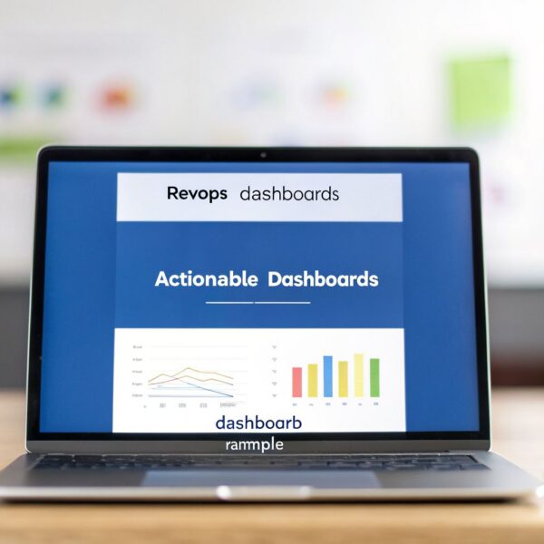
1. Sales Operations Implementation (MarTech Do)
For B2B organizations aiming to move beyond generic dashboard templates, MarTech Do’s Sales Operations service represents a strategic partner. Instead of just delivering static reports, their approach centers on building a complete revenue operations framework where dashboards are the final, functional output of a well-designed system. This makes their methodology an exceptional, albeit different, type of entry for a list of examples of tableau dashboards; they build the strategic foundation that makes advanced analytics possible and meaningful.

This end-to-end process is what distinguishes MarTech Do from consultancies that only provide dashboard-building services. They start with a forensic audit of your existing sales and marketing systems, including Salesforce, HubSpot, and Marketing Cloud Account Engagement (Pardot). This initial step uncovers critical process gaps, data integrity issues, and misaligned pipeline stages that often prevent standard dashboards from providing accurate insights.
Strategic Takeaway: Effective dashboards are built on a foundation of clean data and logical processes. MarTech Do’s audit-first approach ensures that the data feeding into your Tableau dashboards is reliable, which prevents the common “garbage in, garbage out” problem that plagues many analytics projects.
Core Strengths and Service Breakdown
The true value lies in their structured, four-part delivery model that connects technical execution with go-to-market strategy. This ensures the final dashboards are not just visually appealing but are tied directly to measurable business outcomes like improved forecast accuracy and higher conversion rates.
Four-Step Implementation Process:
- Forensic Systems Audit: A deep inspection of your CRM and marketing automation platforms to identify data hygiene problems, broken automations, and process bottlenecks.
- Scalable Process Design: Redesigning the lead-to-revenue journey, optimizing pipeline stages, and creating a clear data architecture.
- Platform-Specific Implementation: Hands-on execution within Salesforce and HubSpot. This includes everything from data migration and custom API integrations to building the automation rules that power the entire system.
- Dashboarding & Team Training: The final step involves creating the dashboards and, crucially, training your team to use and maintain the new system. This focus on enablement ensures the solution provides lasting value. For instance, after structuring your data correctly, you can begin building a dashboard in Salesforce that provides real-time visibility, which can then be integrated with or replicated in Tableau for more advanced analysis.
Why It's a Top Choice for B2B RevOps
MarTech Do is particularly effective for B2B companies struggling with a disconnect between their sales activities and revenue results. Their deep expertise in Salesforce and HubSpot allows them to handle complex technical challenges, such as migrating from a legacy CRM or integrating disparate tools to create a single source of truth.
Their engagement models are flexible, offering one-time projects, ongoing support, or targeted "RevOps boosts," allowing you to align the service with your specific needs and budget. With a track record of over 50 projects and more than $2 million in client-attributed revenue, they offer a proven path to building a data-driven sales organization. While they don't sell off-the-shelf dashboard templates, they provide the strategic and technical services required to make any dashboard, including those built in Tableau, a powerful tool for growth.
| Feature | Description |
|---|---|
| Primary Audience | B2B RevOps, Sales Ops, and Marketing Ops leaders. |
| Platform Expertise | Salesforce Sales Cloud, HubSpot Sales & Marketing Hubs, MCAE (Pardot). |
| Core Offering | End-to-end RevOps implementation: audit, design, build, and training. |
| Key Differentiator | Focus on fixing foundational data and process issues before building analytics. |
Access and Engagement:
You can engage with MarTech Do by visiting their website and scheduling a consultation. Pricing is project-based and tailored to the scope of work, from targeted audits to full-scale system migrations and implementations.
Website: https://martechdo.com/sales-operations/
2. Tableau Viz Gallery
For RevOps professionals seeking inspiration on visual storytelling and design excellence, the Tableau Viz Gallery is an essential destination. Unlike repositories focused on pre-built business templates, the Viz Gallery is a curated showcase of standout visualizations created by the global Tableau community and hand-picked by Tableau’s own team. It serves as a testament to what's possible when data meets creativity, offering a rich source of ideas for layout, color schemes, and interactive features.

While the focus is often on artistry rather than standard corporate KPIs, the underlying techniques are directly applicable to building more engaging and effective B2B dashboards. A RevOps leader might discover a novel way to visualize a sales funnel or a more intuitive method for showing campaign attribution. The gallery’s value lies in pushing the boundaries of what you might consider a "standard" report.
Strategic Analysis and Application
The Viz Gallery excels at demonstrating advanced Tableau functionalities in a real-world context. You can explore how creators use parameters, sets, and complex calculations to build dynamic user experiences.
Key Strategic Insight: Don't just look at the topics; analyze the mechanisms. A visualization about migratory bird patterns might use a filtering technique that would be perfect for segmenting sales territories in your pipeline dashboard. The real value for a RevOps professional is in deconstructing how an effect was achieved and adapting it to a business problem.
Actionable Takeaways for RevOps
While many visualizations are not direct "plug-and-play" solutions for B2B operations, the gallery is a powerful educational tool for marketing and sales ops managers.
- Reverse-Engineer Interactivity: Click on any viz to open it in Tableau Public. Interact with every filter, button, and tooltip. Ask yourself how the creator built that feature and how it could be applied to your own reports. Could a similar dynamic filter help your sales team drill down into regional performance?
- Improve Dashboard Aesthetics: Take note of font choices, color palettes, and spacing. A well-designed, clean dashboard is more likely to be adopted by your team than a cluttered one. The gallery provides countless examples of Tableau dashboards that master visual hierarchy.
- Borrow Storytelling Structures: Analyze how the best visualizations guide the user through a narrative. This is directly transferable to building a dashboard that tells a clear story about marketing ROI or sales cycle velocity. Your Salesforce data is rich with stories; the Viz Gallery can show you new ways to tell them. For teams looking to build more advanced narratives with their CRM data, understanding the fundamentals of creating reports in Salesforce is the first step before applying these advanced visualization techniques.
Website: https://www.tableau.com/viz-gallery
3. Tableau Public Gallery
While the Viz Gallery is Tableau's curated highlight reel, Tableau Public is the entire stadium. It is the world’s largest repository of public-facing Tableau visualizations, hosting millions of interactive dashboards created by a massive global community. This platform serves as a sprawling, searchable library where you can find examples of Tableau dashboards for nearly any industry or use case imaginable, including B2B operational reporting.
What sets Tableau Public apart is its scale and the community’s open-source spirit. Many authors enable a download option for their workbooks. This allows you to open their creation directly in Tableau Desktop, giving you an unparalleled opportunity to deconstruct, learn from, and adapt the architecture of highly effective visualizations. For a RevOps or marketing ops professional, this is like being given the blueprint to a high-performance engine.
Strategic Analysis and Application
The sheer volume of content on Tableau Public means you can find direct analogues for common B2B dashboards, like lead lifecycle funnels, MQL to SQL conversion rates, and sales pipeline velocity. The key is to use the platform's search and filtering capabilities effectively to identify high-quality, relevant examples. You can search for "Salesforce" or "HubSpot" to find dashboards built with similar data structures.
Key Strategic Insight: Focus on "patterning" rather than just copying. Instead of looking for a perfect marketing attribution dashboard to replicate, search for dashboards with exceptional filtering mechanisms or clever parameter actions. A viz on e-commerce sales might have a dynamic date-range selector that would be perfect for your quarterly performance reviews, even if the core subject matter is different.
Actionable Takeaways for RevOps
Tableau Public is less of a gallery and more of a hands-on workshop. The ability to download workbooks transforms it from a source of inspiration into a powerful, practical learning tool.
- Deconstruct Winning Dashboards: Use the download feature whenever available. Open the workbook and examine the data sources, calculated fields, parameter setups, and dashboard actions. This reverse-engineering is one of the fastest ways to master advanced Tableau techniques and apply them to your own Salesforce or HubSpot data.
- Source KPI Layout Ideas: Search for terms like "Sales Pipeline," "Marketing Funnel," or "SaaS Metrics." You will find thousands of examples of Tableau dashboards that show different ways to organize and present core business KPIs. Take note of how different creators handle layout, what charts they choose for specific metrics, and how they build interactivity to allow for drill-down analysis.
- Validate Your Own Concepts: Before spending hours building a complex dashboard, search Tableau Public to see if someone has already tackled a similar problem. This can save significant development time and provide a proven structure for your own reporting, helping you build more effective dashboards for tracking metrics from lead generation tools or go-to-market data sources like Clay.
Website: https://public.tableau.com
4. Tableau Dashboard Examples (Official)
For RevOps professionals who need to move from inspiration to implementation, Tableau's official Dashboard Examples page is a critical resource. Unlike the artistic focus of the Viz Gallery, this collection presents polished, production-ready dashboards often sourced directly from organizations. It's an excellent starting point for understanding how to structure reports for executive audiences and departmental teams, offering a more direct translation to corporate environments.

These examples are embedded in their original context, showcasing how real businesses track everything from supply chain logistics to marketing campaign performance. While the selection is smaller than the vastness of Tableau Public, its value is in its business-centric focus. This curated collection saves time by presenting proven structures for displaying key KPIs, setting up drill-down functionalities, and organizing information for clear, actionable insights.
Strategic Analysis and Application
This page provides a bridge between abstract data art and the practical dashboards needed to run a B2B business. The examples demonstrate established best practices for clarity and function, making them a reliable blueprint for your own internal reporting. You can see how different industries approach similar problems, such as performance tracking or resource allocation.
Key Strategic Insight: Focus on the layout and user flow of dashboards relevant to your function. An example tracking public health metrics might seem unrelated, but its use of BANs (Big-Ass Numbers) for key stats and clear geographic filters is directly applicable to a sales territory performance dashboard. Analyze the information hierarchy: what data is presented first, and what requires a click to reveal?
Actionable Takeaways for RevOps
The business-oriented nature of these dashboards provides immediate, practical ideas for any sales, marketing, or customer success operations team.
- Adopt Proven KPI Layouts: Examine how successful dashboards present top-line metrics. Many use a header section with key numbers (e.g., Total Revenue, MQLs, Closed-Won Deals) before diving into detailed charts. This is a best practice for executive-level reporting.
- Study Functional Interactivity: Pay attention to how filters and parameters are used to answer business questions. A common pattern is using a high-level filter for time (Quarter, Month) and secondary filters for segments (Region, Product Line). This model can be directly applied to your Salesforce or HubSpot data. Learning the fundamentals of how to create dashboards in Salesforce provides the foundation needed to build these multi-layered reports.
- Find Downloadable Templates: When an author permits it, you can download the workbook. This is one of the most effective ways to learn, as it allows you to deconstruct the entire dashboard, from the data source connections to the specific calculations and formatting used. Reverse-engineering these professional examples of Tableau dashboards is a masterclass in effective BI.
Website: https://www.tableau.com/dashboard-examples
5. Tableau Exchange – Accelerators
For RevOps teams that need to deploy effective dashboards quickly, the Tableau Exchange – Accelerators are the fastest route from zero to functional. This official library offers dozens of pre-built, professional-grade dashboards designed by Tableau and its partners. These "Accelerators" are essentially robust templates for specific business functions like sales, marketing, finance, and support, built with sample data that you can replace with your own.

Unlike a gallery focused on creative inspiration, Accelerators are built for immediate business application. A sales operations manager can download a "Sales Pipeline" Accelerator and, with some configuration, have a live dashboard connected to their Salesforce or HubSpot data in hours, not weeks. The primary benefit is speed and standardization, giving you a proven starting point for tracking core KPIs and establishing consistent reporting across the organization.
Strategic Analysis and Application
Accelerators are designed to solve common business problems out of the box. You can filter the library by industry, business department, or even by the native data source connector, such as Salesforce, to find a dashboard that closely matches your needs.
Key Strategic Insight: Use Accelerators as a baseline, not a final destination. The true strategic value comes from using the pre-built logic and design as a foundation. A marketing team can adopt the "Campaign Performance" Accelerator and then customize it by adding specific attribution models or integrating lead enrichment data from a tool like Clay, making it uniquely suited to their GTM motion.
Actionable Takeaways for RevOps
Accelerators significantly reduce the initial development effort, allowing your team to focus on customization and analysis rather than building from scratch.
- Jumpstart Executive Reporting: Find an Accelerator for "Executive KPIs" or "Business Overview". Connect it to your primary data sources to quickly deliver a high-level summary to leadership. This establishes a baseline for performance metrics that you can refine over time.
- Validate Your Data Model: The process of mapping your data to an Accelerator’s fields is a practical audit of your data structure. If you struggle to connect your Salesforce Opportunity stages to the fields in a "Sales Funnel" Accelerator, it’s a clear sign your CRM data might need cleaning or standardization.
- Deconstruct Best Practices: Even if you don't use the Accelerator directly, download it to see how Tableau experts structure calculations, parameters, and layouts for a specific business case. These are excellent examples of Tableau dashboards that demonstrate production-quality design and logic that you can apply to your own custom-built reports.
Website: https://exchange.tableau.com/en-us/accelerators
6. Workout Wednesday (Tableau)
For professionals who learn best by doing, Workout Wednesday offers a unique, hands-on approach to mastering Tableau. Instead of a passive gallery of finished dashboards, this community-driven platform presents a weekly challenge: recreate a specific data visualization from scratch. Each challenge provides a goal, a dataset, and detailed requirements, pushing you to move beyond theory and build production-ready skills through practical application.

The focus is squarely on technique and problem-solving. Challenges often center on replicating advanced chart types, complex calculations, or sophisticated user interface (UI) interactions that are directly transferable to a business context. A RevOps analyst might complete a challenge on building dynamic parameter actions and immediately see how to apply that method to create a more intuitive marketing campaign performance dashboard.
Strategic Analysis and Application
Workout Wednesday’s true power lies in building technical muscle memory. The challenges force you to engage with Tableau's more complex features, such as Level of Detail (LOD) expressions, table calculations, and parameter controls, in a structured, goal-oriented environment.
Key Strategic Insight: Treat each challenge as a technical deep dive. The goal isn't just to match the final picture; it's to understand the why behind each step. A challenge focused on creating a custom KPI tile, for instance, provides a reusable blueprint for displaying MQL-to-SQL conversion rates or ARR growth in your own executive dashboards.
Actionable Takeaways for RevOps
While the topics are diverse, the underlying skills are universal for any operations professional building reports. The extensive archive provides a free, self-paced curriculum for advancing your Tableau proficiency.
- Build a Reusable Component Library: As you complete challenges, save the workbooks. You are effectively building a personal library of solutions for common dashboard needs, such as toggle switches, drill-down charts, and dynamic text boxes. When you need to show period-over-period growth in your HubSpot data, you can refer to a past challenge instead of starting from zero.
- Master Advanced Calculations: Many B2B metrics, like calculating sales cycle velocity or multi-touch attribution, require complex calculations. Workout Wednesday provides focused practice on the exact types of calculations (LODs, window functions) needed to translate these business requirements into a functional Tableau report.
- Develop an Eye for Detail: Recreating a viz pixel-for-pixel trains you to notice and implement key design elements: proper alignment, effective use of white space, and consistent font hierarchies. This attention to detail elevates your internal examples of Tableau dashboards from cluttered data dumps to polished, professional reports that executives will actually use and trust.
Website: https://workout-wednesday.com/
7. InterWorks – Viz Gallery
For those looking to build dashboards with an agency-grade level of polish, the InterWorks Viz Gallery is an invaluable resource. As a prominent Tableau consultancy, InterWorks showcases projects that reflect a deep understanding of corporate aesthetics and user experience design. This gallery features a curated collection of dashboards that are both visually appealing and functionally robust, providing a blueprint for creating reports ready for an executive audience.

Unlike broad community platforms, the InterWorks gallery offers a more focused look at dashboards designed with clear business purposes in mind. The work often demonstrates sophisticated navigation, clean layouts, and intuitive filtering mechanisms. For a RevOps leader, this translates into practical ideas for organizing complex Salesforce or HubSpot data into a digestible format that senior leadership can easily act upon.
Strategic Analysis and Application
The primary value of the InterWorks gallery lies in its demonstration of enterprise-ready design patterns. These examples show how to structure dashboards that guide users logically from high-level KPIs to granular details without causing confusion. Many visualizations are accompanied by blog posts that explain the design rationale or technical execution, offering an educational layer.
Key Strategic Insight: Pay close attention to the user interface (UI) and user experience (UX) patterns. An InterWorks dashboard might feature a custom navigation bar or a clever use of collapsible containers. These are not just aesthetic choices; they are strategic decisions to improve usability and encourage dashboard adoption among sales and marketing teams.
Actionable Takeaways for RevOps
While not every viz is downloadable, the design principles are universally applicable and can immediately elevate your internal reporting.
- Study Executive-Ready Layouts: Analyze how dashboards are structured for C-level consumption. Notice the use of clear titles, summary KPIs at the top, and logical flow. This is a masterclass in building examples of Tableau dashboards that communicate value quickly and effectively.
- Borrow Navigation and Filter Designs: Look for examples with intuitive drop-down menus, clear buttons, and on-screen instructions. Replicating these user-friendly designs in your own pipeline or marketing attribution dashboards can significantly reduce the learning curve for your team.
- Adapt Storytelling for Business Contexts: Many dashboards in the gallery tell a compelling story, whether about business performance or public data. Deconstruct how they use a combination of charts, text, and interactivity to build a narrative. Apply these techniques to tell a clearer story about your lead-to-revenue cycle using your CRM data.
Website: https://interworks.com/viz-gallery
Comparison of 7 Tableau Dashboard Examples
| Item | Implementation complexity | Resource requirements | Expected outcomes | Ideal use cases | Key advantages |
|---|---|---|---|---|---|
| Sales Operations (MarTech Do) | High — custom integrations, migrations, process redesign | Significant budget/time, platform expertise, internal training | Scalable lead-to-revenue flows, reliable forecasting, measurable ROI | B2B revenue teams needing end-to-end RevOps and migrations | End-to-end execution, deep Salesforce/HubSpot/Pardot expertise, proven track record |
| Tableau Viz Gallery | Low to medium — consumeable examples, some require reverse engineering | Minimal (web access); Tableau for download/edits sometimes | Quick design and storytelling inspiration | Rapid ideation for layout and interactivity | Curated, high signal‑to‑noise selection |
| Tableau Public Gallery | Low to medium — browse thousands; implementation varies by workbook | Web access; Tableau Desktop for many downloads | Broad pattern recognition and practical examples to copy or learn from | Researching KPI layouts, filters, and community best practices | Massive breadth and many downloadable workbooks |
| Tableau Dashboard Examples (Official) | Low to medium — polished embedded examples, some downloads | Web access; occasional workbook downloads | Production‑style dashboards suitable for executives and departments | Emulating enterprise reports and KPI structures | Business‑oriented, proven dashboard structures |
| Tableau Exchange – Accelerators | Low to medium — plug‑and‑play templates requiring data mapping | Tableau Desktop or connector setup; mapping time | Fast, working executive/ops dashboards tailored by industry | Quick launches of industry/role dashboards and standard KPIs | Ready‑made templates, consistent metrics and UX patterns |
| Workout Wednesday (Tableau) | Medium to high — hands‑on challenges with technical focus | Time investment, Tableau Desktop to open solutions | Improved technical skills; reusable advanced techniques | Skill building for calculations, parameters, and advanced charts | Targeted practice with example solutions and step‑by‑step briefs |
| InterWorks – Viz Gallery | Low to medium — curated, agency‑grade examples | Web access; supplemental blog posts may explain methods | Polished designs and navigation patterns for enterprise use | Adapting high‑quality UX and storytelling for internal dashboards | High visual design standard and explanatory context |
Final Thoughts
Throughout this exploration of Tableau dashboard examples, a clear pattern has emerged. The most effective dashboards are not merely collections of charts; they are purpose-built analytical tools designed to answer specific business questions and drive strategic action. From the official Tableau galleries to community-driven resources like Workout Wednesday and expert-curated collections from InterWorks, the focus is always on translating raw data into clear, operational insights.
We have seen how a Sales Operations dashboard can pinpoint pipeline blockages and how marketing analytics can reveal the true ROI of a campaign. The key is moving beyond passive reporting. The goal is to create an interactive environment where a RevOps leader can drill down from a high-level KPI to the individual records in Salesforce or HubSpot that require immediate attention. This transition from observation to action is what separates a good dashboard from an essential business asset.
Key Takeaways for Your RevOps Strategy
As you move forward to build or refine your own analytics, remember these core principles drawn from the diverse examples of Tableau dashboards we've examined:
- Audience-Centric Design is Non-Negotiable: A dashboard built for a CEO tracking quarterly growth must look and function differently from one designed for a sales manager monitoring daily team activity. Always start by defining the user, their primary questions, and the decisions they need to make.
- Data Integration is the Foundation: Your insights are only as reliable as your data. A successful Tableau implementation depends on clean, well-structured data flowing consistently from your core systems like Salesforce Sales Cloud and HubSpot. Prioritizing data hygiene and robust integration is a critical first step.
- Interactivity Drives Adoption: The best dashboards invite exploration. Features like filters, drill-downs, and tooltips empower users to answer their own follow-up questions, fostering a culture of data self-service and reducing dependency on analyst requests.
Your Actionable Next Steps
Building on these insights requires a structured approach. Before you even open Tableau, outline your project. Start by identifying the single most critical business process you need to improve, whether it's lead-to-cash velocity, marketing attribution, or customer retention. Then, define the 3-5 key performance indicators that measure the health of that process.
Next, map out your data sources. Do the necessary fields exist in Salesforce? Is your HubSpot data structured for easy analysis? This is where tools for data enrichment and preparation, like Clay, can be instrumental in filling gaps and ensuring your CRM data is complete and accurate before it even reaches Tableau. This preparation phase is crucial; investing time here prevents significant headaches during the visualization stage.
Ultimately, the power of viewing examples of Tableau dashboards is not just about finding a template to copy. It's about understanding the art of the possible and recognizing how strategic data visualization can directly influence revenue operations. The goal is to build a dashboard that doesn't just show you what happened yesterday, but helps you decide what to do tomorrow. By focusing on a clear purpose, clean data, and a user-focused design, you can construct a powerful analytical tool that becomes central to your GTM strategy and a true catalyst for growth.
Are you feeling inspired by these examples but unsure how to connect your complex Salesforce or HubSpot data into a cohesive, actionable dashboard? This is a common challenge where expert guidance makes all the difference. MarTech Do specializes in GTM engineering and RevOps implementation, helping B2B companies build the foundational data architecture required for powerful analytics. Visit MarTech Do to see how we can help you transform your raw CRM data into the strategic insights you need to drive revenue.